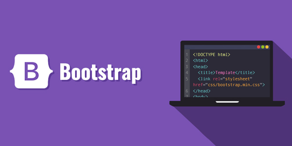
Bootstrap
Bootstrap is the most popular open-source front end development framework for developing responsive, mobile-first front-end web applications web sites. It is a faster and easier way to develop the web. It creates platform-independent web-pages. It creates responsive web pages. It designs responsive web pages for mobile devices too.
Bootstrap themes, templates, and Ul tools contains HTML, CSS and (optionally) JavaScript-based design templates for typography, forms, buttons, navigation, and other interface components
Responsive design makes it possible for a web page or app to detect the visitor's screen size and orientation and automatically adapt the display accordingly; the mobile first approach assumes that smartphones, tablets and task-specific Mobile apps are employees' primary tools for getting work done and addresses the requirements of those technologies in design.
Bootstrap includes user interface components, layouts, and JS tools, along with the framework for implementation. Nowadays, the websites are perfect for all browsers (IE, Firefox, and Chrome) and for all sizes of screens (desktops, tablets, laptops, and phones). All thanks to Bootstrap developers
Build fast, responsive sites with Bootstrap Powerful, extensible, and feature-packed front-end toolkit. Build and customize with Sass, utilize prebuilt grid systems components, and bring projects to life with powerful JavaScript plugins.


